A true champion can adapt to anything. — Floyd Mayweather, Jr.
 Let’s not pull any punches
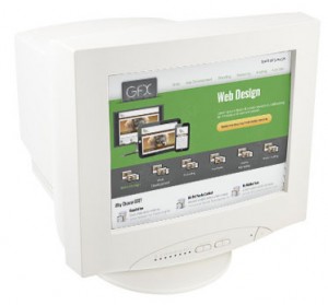
Web design used to be a lot easier when all monitors looked something like this — a square. The screen might be a little larger or a little smaller, but it was basically the same, ordinary shape. Then along came the iPhone and all of its screen-rotating cousins.
And this changed everything
The iPhone and other smart phones, followed by the Apple iPad and a storm of other tablets, introduced tiny to medium-sized screens that not only featured a new shape for the browser window, which was decidedly rectangular, they also rotated that shape on the fly, from the typical landscape view to portrait view and then back again, all at the flick of a wrist. Not even a specially designed mobile webpage could deal with this change in user habits.
What’s more, screen sizes now range from business card little to wide screen TV gigantic. It’s more than the typical website with standard display instructions can handle, so pages are often shrunk to microscopic and can make navigation difficult for the mobile user (“Point your finger right there on that miniscule spot. No, not there, here! Oops, that’s not the page we want! Grrrr!”). The frustration faced by mobile users often leads a promising client to take their business to friendlier web pages. On the other hand, if you have a huge screen to work with, pages can look plain and take up only a fraction of the monitor size, failing to use the available broad digital canvas.
Web designers are a pretty smart bunch, however, and we have a fix for this problem — the responsive website.
Responsive websites adapt
This website is responsive. Try looking at this page on your smart phone or tablet while you simultaneously view it over your ordinary computer monitor. Notice the differences? Switch from landscape to portrait view and note how the page keeps up with the changes. If the screen size is large, the navigation works one way. If the screen size is small, the page responsively adapts, and provides navigation and lettering designed for smaller formats. Instead of having multiple pages for multiple formats, you have one page that responds to the size and orientation of the user’s monitor. That’s putting technology to work for you. That’s being responsive.
The online knock-out punch
Of course, it takes more time to design and create a responsive web page, but it’s far more efficient than creating multiple pages built with instructions for different viewing formats. In the end, going with a responsive page design makes your website more adaptable and prepared for whatever new format comes out in the future. What’s it like if you have responsive pages and your competitors don’t? Sounds like a knock-out punch to us.
